
Giraffe IDE Introduction
Giraffe IDE is a human-machine interaction UI development tool developed by Shanghai Top Display Optoelectronics Co., Ltd.
The user can quickly implement a WYSIWYG(What You See Is What You Get) interface similar to the Android UI components by dragging and dropping the built-in controls with the mouse on the PC host software. This greatly simplifies the development process, shortens the development process, and improves the user experience.
GiraffeIDE's System Advantages:
Provides an internal system simulation window.
Provides a standard C language development compilation environment.
Own UI development framework.
Provides WYSIWYG configurable UI development tools.
Provides a complete open writing section for logic code.
Provides different control themes for more comfortable design.
Provides a rich API interface for users to call directly.
Remote update system capability.
Continuously updated control packages and system updates.
Continuously updated documentation and demo support.
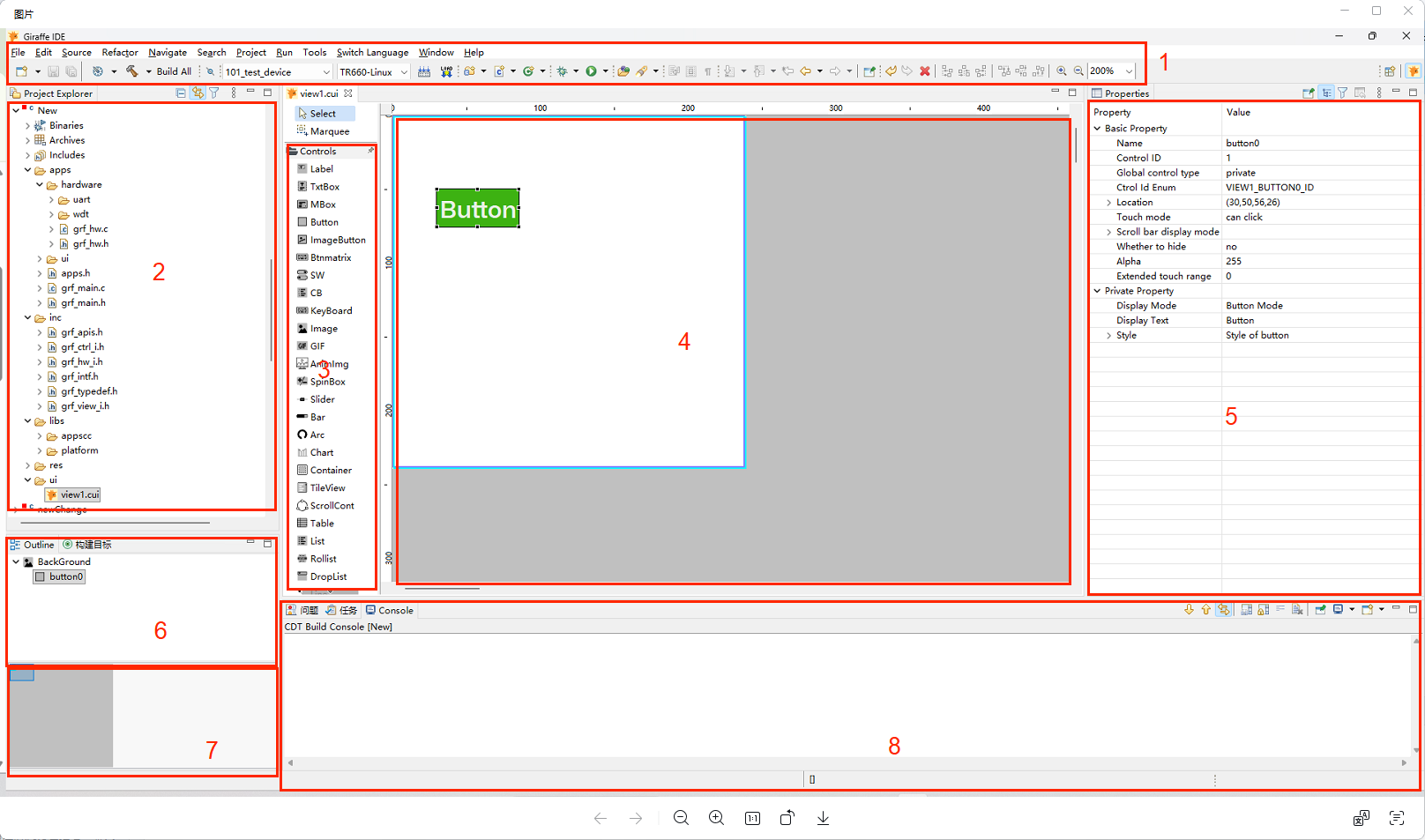
1. Menu Toolbar
Software function portal.
2. Project Structure Area
Project tree structure, clearly showing the hierarchy of the project structure.
3. Control Area
A collection of controls required for UI design.
4. View UI Design Area
A valid area for UI design, where you can drag and drop controls with the mouse to perform UI design.
When dragging a control, you can either drag it directly from the control area to the UI space to generate a control, or you can drag it directly inside an existing control to form a nested relationship.
The view UI design area can be zoomed with ctrl + mouse wheel when the view area is selected.
5. Control Parameters Area
Set the parameters of the selected control in this area after mouse click to select the control
6. Current View Outline
The outline of the current design view is arranged to show all controls in the current view and the relationship between controls. When you select a control with the mouse in the outline, the view UI design area is also selected accordingly.
When you drag and drop a control in the outline, you can change the order of the controls or change the nesting relationships of the controls. For example, drag a control inside another control, or drag a control out of its parent control to change the sibling relationship.
7. View Thumbnails
Thumbnails of the current UI design area
8. Console
Print the project log and see the project status at a glance.
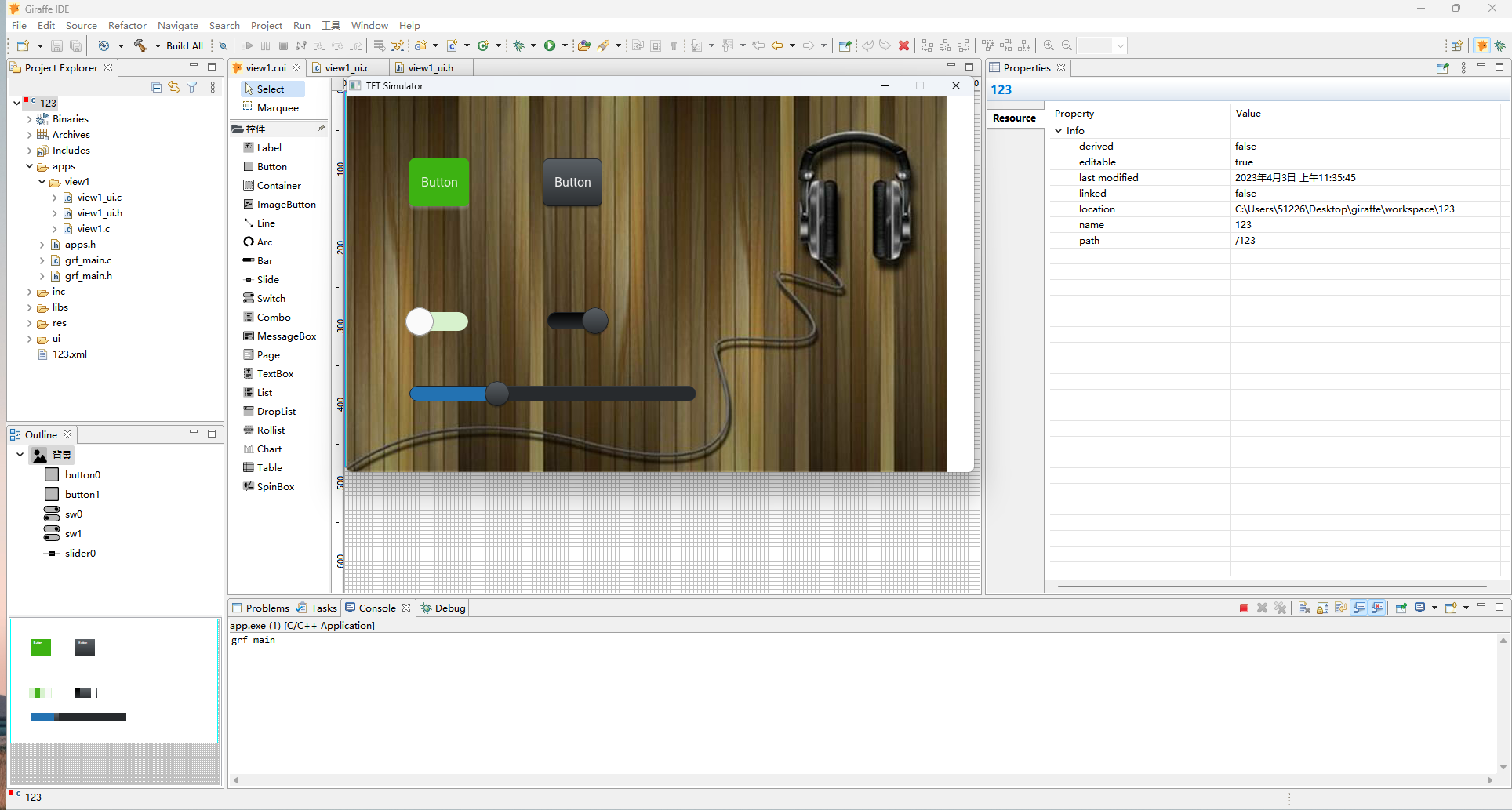
What effects can Giraffe achieve?
Background size can be set to any size and can display any pixel image, if the image is larger than the view pixel, it will be automatically compressed.
All controls can be individually styled to ensure that each control is unique.
Label text control: It can display text in any font
Button control: As a general purpose input/output control, buttons are used extensively in UI design. The button text can be set directly in the button, eliminating the need to add a separate text control. The size and position of the button can be adjusted directly with the mouse, and button styles such as colour, rounded corners and borders can be set in the properties. Once the button is generated you can add your own code to the corresponding event function.
image control: you can add any image in
.jpgor.pngformat.Container control: the container control can be used as a carrier for any other type of control.
Image button control: you can set a different picture for each state of the button.
Line control: you can connect lines between coordinate points.
Arc control: control that can be used to draw arcs.
Bar control: can be used to display progress information.
Slider control: change the progress of the bar by sliding the slider.
SW control: change the state of the switch by sliding or clicking.
CB control: checkboxes can be checked/unchecked.
Mbox control: for message prompting, action selection and guiding the user through actions.
Txtbox control: the usual text input box with password mode.
List control: list item buttons arranged from top to bottom, with images and text inside the buttons.
Droplist control: a list control that can be collapsed and expanded.
Rollist control: a scrolling list control.
Chart control: display line, bar, scatter and area charts.
Table control: free to set the rows and content of the table control.
Spinbox control: Adjust data increment and decrement.
gif control:You can add
.gifanimated images.QRcode control: Can be used to add QR codes containing specific information.
video control: For playing video files in
.mp4format.keyboard control: You can enter Chinese and English text in the
txtboxcontrol.Btnmatrix Control: A batch button set arranged in rows and columns.
AnimImg Control: A control dedicated to displaying dynamic images or frame-sequence animations.
TileView Control: A container control that supports sliding operations.
Scrollcont Control: A container control with cyclic scrolling functionality.
Sketchpad Control: A canvas control that supports freehand drawing with a brush.